Animation or Motion Effects Using Office UI Fabric/Fluent UI In SPFx
Fluent UI motion attracts the attention of the user and provides an interaction while using the React component. To learn more about fluent Motion, please refer to its documentation here. Even though the documentation is very clear, a simple example is missing. In this article, we will see how we can use the motion effects in the SPFx webpart.
Initial Steps
- Create a react framework webpart using yo @microsoft/SharePoint command. Refer to this article if this is your first webpart.
- Now if you check your package.json, you can see that office-ui-fabric-react package is already present. Therefore, there's no need to install any other package to get started.
- "office-ui-fabric-react": "6.189.2",
- Now, I have created a CSS class style called rectangle in my SCSS file in global scope:
- :global {
- .rectangle{
- width: 100px;
- height: 200px;
- background: green;
- background-color: green;
- }
- }
- In my main component file, I have created a state variable called rectangleClassName and given the initial value as a rectangle
- this.state = {
- rectangleClassName: "rectangle"
- }
- In my render() method, I have created a div and className as the state variable:
- <div className={this.state.rectangleClassName}></div>
- If you run the gulp serve, you can see the darkgreen color rectangle in the browser.


Steps to Apply a Motion Effect
- The motion effect will be applied, only when it is added to the DOM. The effects will be visible when adding it for the first time. If you want to apply a new effect to the same element, the previous effect has to be removed and the new effect has to be added. Let's see in the example.
- To apply the effect, I have created a button and on a button click, the fluent UI motion class name will be added to the rectangleClassName state variable.
- In the render() method,
- //imported PrimaryButton component from fabric react
- import { PrimaryButton } from 'office-ui-fabric-react';
- //in the render method, add the button and call the method to add classname
- <PrimaryButton text="rotate90deg" onClick={this.rotate90deg} />
- The method adds the rotate 90 degree motion class:
- private rotate90deg = () => {
- this.setState({
- rectangleClassName: "rectangle ms-rotate90deg"
- });
- }
- Now save the file. In the workbench, if you click the button rotate90degree, you can see the effect being applied.
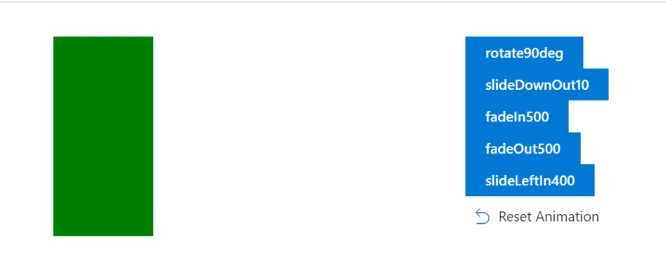
- In the attached source code, I have added 4 more effects:
List of Motion Effect Classnames
| Slide effects | Scale effects | Fade effects | Expand collapse effects | Delay effects | Rotate effects |
| ms-slideRightIn10 | ms-scaleUpIn100 | ms-fadeIn100 | ms-expandCollapse100 | ms-delay100 | ms-rotate90deg |
| ms-slideRightIn20 | ms-scaleUpOut103 | ms-fadeIn200 | ms-expandCollapse200 | ms-delay200 | ms-rotateN90deg |
| ms-slideRightIn40 | ms-scaleDownOut98 | ms-fadeIn400 | ms-expandCollapse400 | ||
| ms-slideRightIn400 | ms-scaleDownIn100 | ms-fadeIn500 | |||
| ms-slideRightOut40 | ms-fadeOut100 | ||||
| ms-slideRightOut400 | ms-fadeOut200 | ||||
| ms-slideLeftIn10 | ms-fadeOut400 | ||||
| ms-slideLeftIn20 | ms-fadeOut500 | ||||
| ms-slideLeftIn40 | |||||
| ms-slideLeftIn400 | |||||
| ms-slideLeftOut40 | |||||
| ms-slideLeftOut400 | |||||
| ms-slideUpIn10 | |||||
| ms-slideUpIn20 | |||||
| ms-slideDownIn10 | |||||
| ms-slideDownIn20 | |||||
| ms-slideUpOut10 | |||||
| ms-slideUpOut20 | |||||
| ms-slideDownOut10 | |||||
| ms-slideDownOut20 |


Comments
Post a Comment
Thank you for your comment.